
LCAMP: Learner-Centric Advanced Manufacturing Platform
Turning a neglected project website Into a usable platform
September 2025 - May 2026
Key outcomes
• 4 card sorting sessions with 3 stakeholder groups to define the information architecture • Complete visual redesign and Elementor build from Figma, achieving near 1:1 fidelity • Integrated Skilldata-powered learner tools (skill profiler, course browser, job browser) and three institutional tools into the site
The Problem
LCAMP (Learner-Centric Advanced Manufacturing Platform) is an EU project connecting vocational education institutions around advanced manufacturing. When I came in, the website looked like what you'd expect from a project that had been built by non-designers and accumulated content over time: cluttered, visually inconsistent, hard to navigate and containing plenty of dead links and non-functional buttons. The deliverables section was particularly bad, with dozens of documents dumped on a page with no real organisation.
But this wasn't just a cosmetic problem. The site had an identity crisis. It needed to function as a standard EU project website (deliverables, consortium info, news, conferences) while also being a genuine platform where students could discover courses, assess their skills, and browse manufacturing jobs. Those two purposes pulled in different directions, and the old site hadn't resolved the tension at all. Some of the tools existed but were buried in the navigation, while others were still being developed for the upcoming LCAMP 2026 conference.
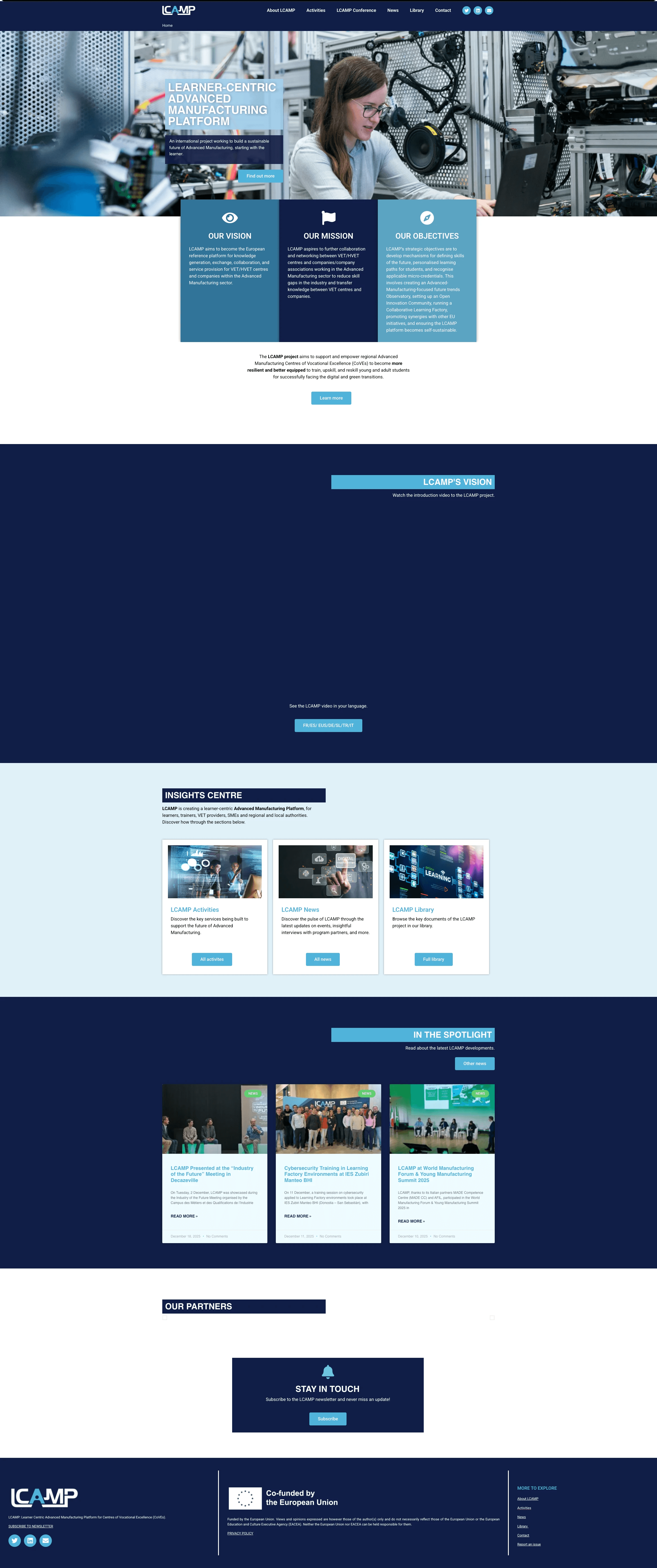
Old homepage
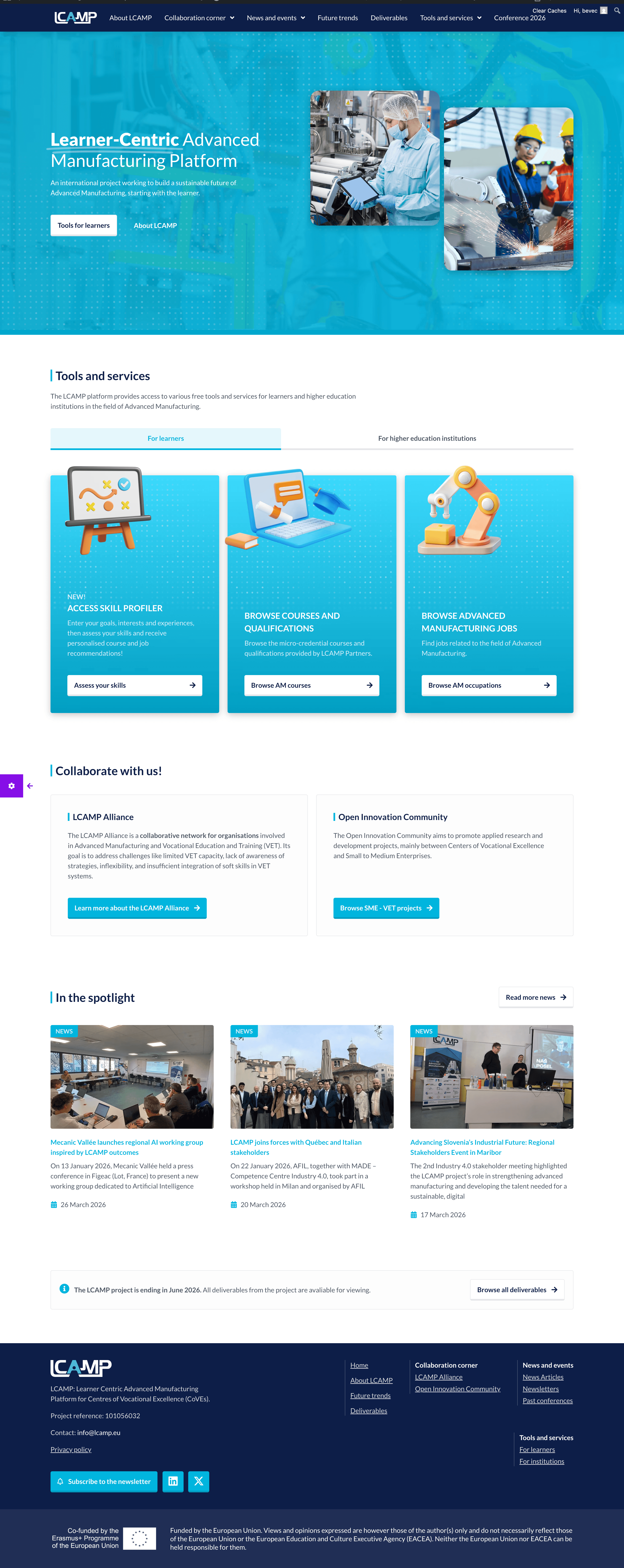
New homepage
My Approach
Card sorting to resolve the information architecture question
Before touching any visual design, I ran 4 card sorting sessions across 3 different stakeholder groups: LCAMP project partners (internal, 2 sessions), students enrolled in advanced manufacturing courses, and alliance members (representatives from partnered institutions not directly running the project). Sessions were conducted remotely in Miro.
I prepared the studies drawing on my experience from my master's thesis card sorting work. Each group sorted the same set of content items into categories and named them. Afterwards, I facilitated a discussion with participants about their reasoning, so the sessions doubled as focus groups.
The key finding was that project insiders and external users think about the content very differently. Students didn't care about deliverables or consortium structure. They wanted tools and courses front and centre. Alliance members wanted collaboration opportunities and resources. Project partners expected the standard EU project site structure. The final information architecture had to serve all three without making any group dig for what they needed.
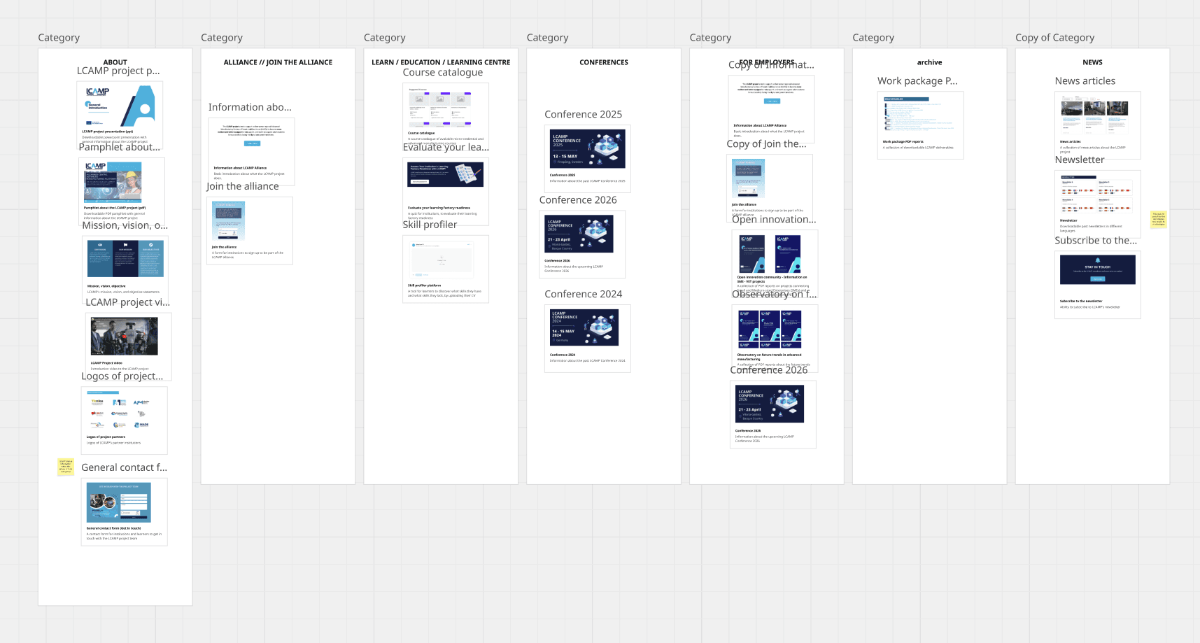
Miro board with card sorting results from one of the groups
Redesigning from scratch
I kept the LCAMP colour palette but redid everything else: layout, typography, visual hierarchy, imagery (sourcing 3D icons from Freepik to give a friendlier feel to an otherwise dry subject). The homepage was structured to surface the tools prominently rather than burying them behind a menu.
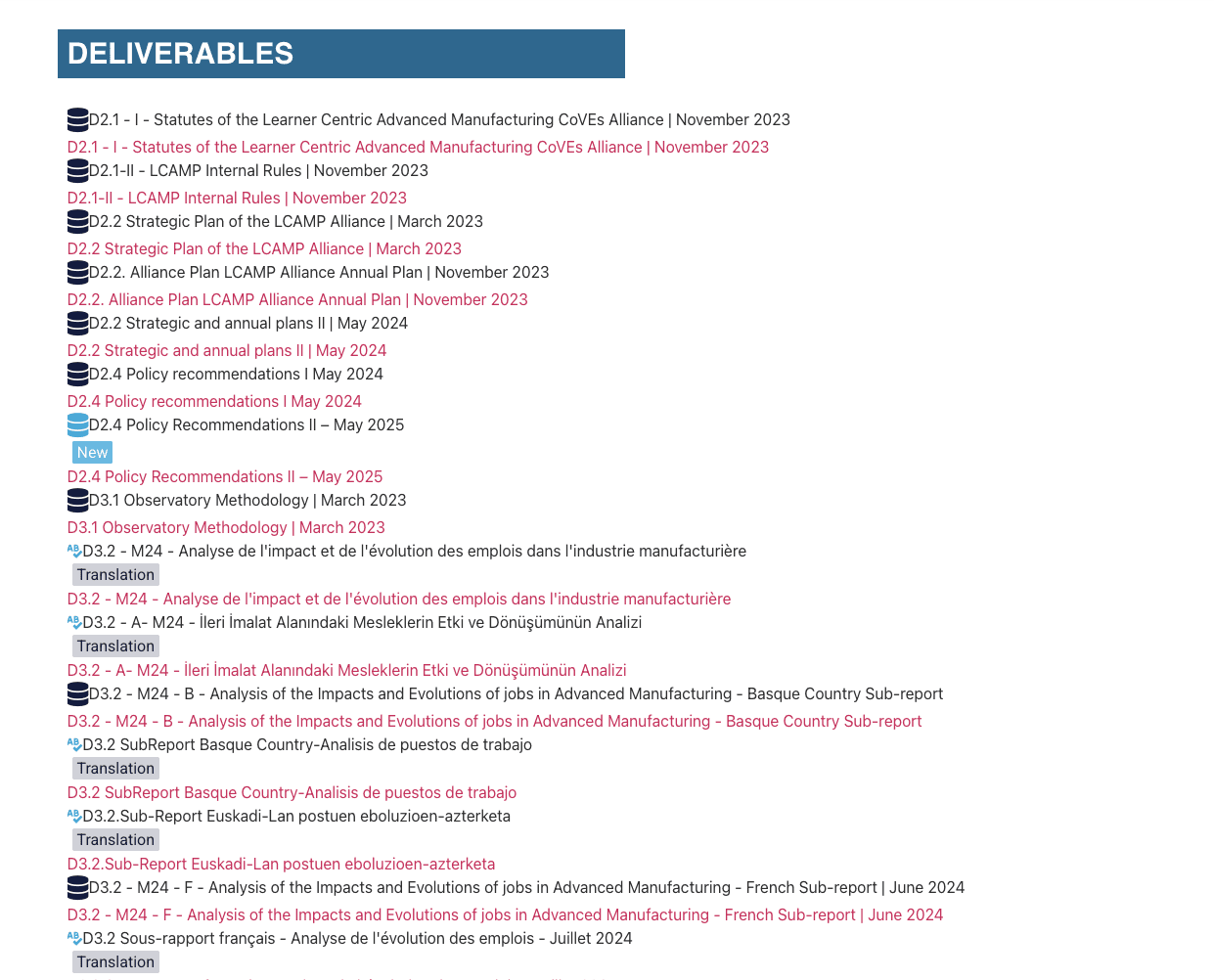
The deliverables page got special attention. The old version was a flat list of PDFs, with the same document repeated up to eight times in different languages, making everything hard to find. I reorganised it into two layers of categorisation (work package and sub-category), and where a document exists in multiple languages, the English version sits as the primary entry with the translations nested visually underneath it.
Old deliverables database
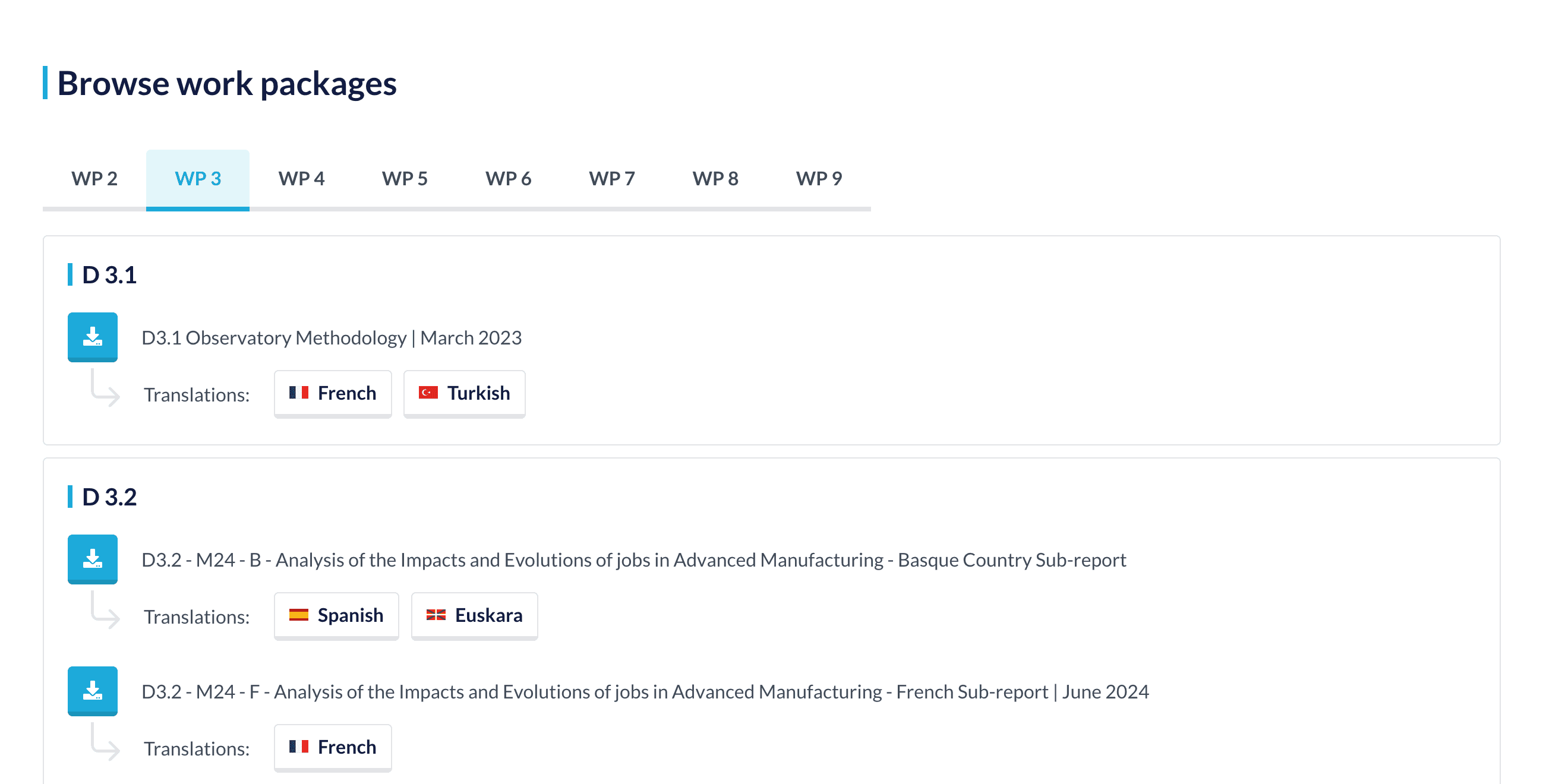
New deliverables database
Building it in Elementor
I designed everything in Figma, then imported it into Elementor via UIChemy and fixed all the breakages that come with that process. Getting it to near pixel-perfect fidelity with the Figma file in Elementor is genuinely difficult, and this project is probably the best example of how far I've gotten with that tool.
The Solution
The site now has two clear entry points for its two audiences. The standard project content (about, deliverables, news, conferences, alliance info) lives in the navigation where EU project reviewers and partners expect it. The tools and services section splits into "For learners" and "For institutions," each with its own page.
For learners, three tools are integrated (powered by Skilldata, styled to match LCAMP branding): a skill profiler where students assess themselves and get personalised course and job recommendations, a course and qualification browser, and an advanced manufacturing job browser.
For institutions, three separate tools: a learning factory readiness assessment questionnaire, a browsable repository of instructions on setting up a learning factory, and a CLF resource repository.
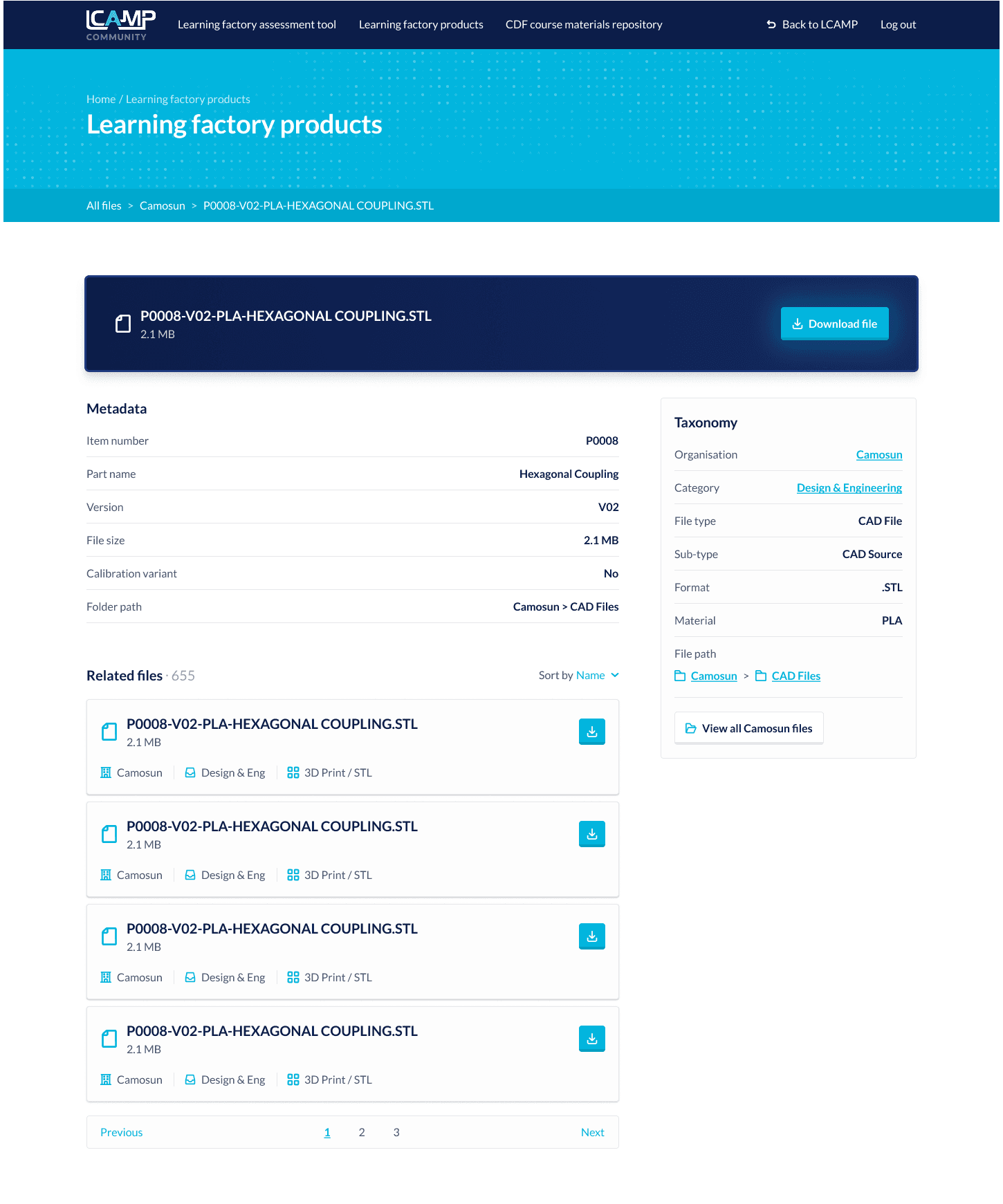
CLF resource repository tool for LCAMP Alliance members
The Outcome
The redesigned site was unveiled at the LCAMP Conference 2026 in Vitoria-Gasteiz, Basque Country, and is now live at lcamp.eu. The information architecture is directly based on the card sorting research, and the tools that were previously invisible are now the most prominent thing on the homepage.