
Interface for adding questions in 1KA (MA thesis)
A research-driven redesign of a survey tool's most-used feature
February 2024 - March 2025
Key outcomes
• Competitor analysis of 22 survey tools across 13 variables • Card sorting study with 5 participants sorting 37 question types • Redesign proposal: 10 thematic groups, 38 question types, 9 UI building blocks • High-fidelity Figma prototype delivered to the 1KA team
Introduction
The interface for adding questions is the most-used feature in any survey builder. Every user triggers it multiple times per session, every session. In a tool like 1KA, a Slovenian academic survey platform with over 100,000 registered users, even a minor usability issue there compounds at scale. My master's thesis was a full research-driven redesign of 1KA's question-adding UI, combining competitor analysis and card sorting to produce a validated blueprint for redesigning this feature.
The problem
1KA's old question-adding interface had 27 question types across 7 groups. The groupings were arbitrary: no user input had shaped them. Types had no icons, making scannability poor. Rarely used types got the same visual weight as common ones, sometimes more. Frequently used types were hidden below the fold. Some items weren't questions at all (Calculation, Quota) but were presented identically to actual question types. Naming was inconsistent, particularly for users without a survey methodology background.
Beneath all of this was a structural problem. 1KA's backend had 15 question types, each with sub-types and layout variants, amounting to 56 distinct variations in total. Almost none of those variants were surfaced coherently. The interface felt arbitrary to new users and incomplete to experienced ones.
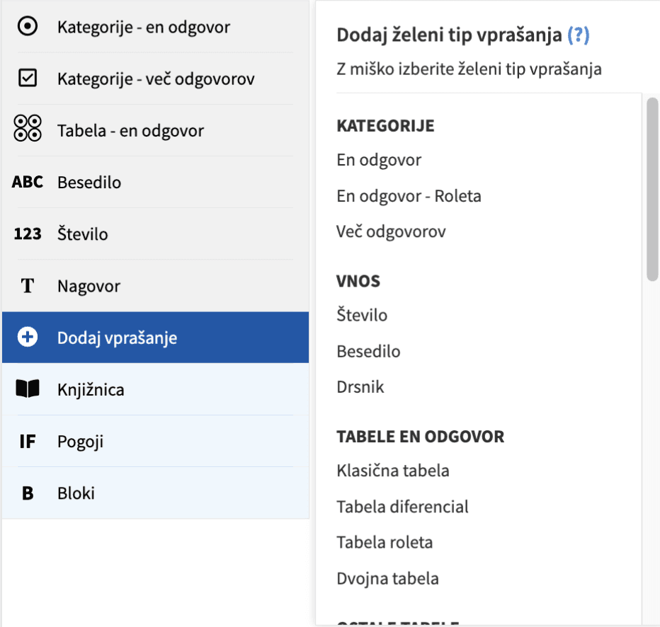
The old 1KA interface for adding questions
The approach
Competitor analysis
For the competitor analysis, I reviewed 23 survey tools, including SurveyMonkey, Qualtrics, Typeform, JotForm, and Google Forms, coding each against 13 variables: interface type, grouping logic, column count, number of question types, clicks required to add a question, icons, search bars, and previews, among others. The main finding was that despite how standardised survey-creation flows are across tools, the question-adding interface varied considerably. No dominant pattern had emerged, which suggested the space was under-researched.
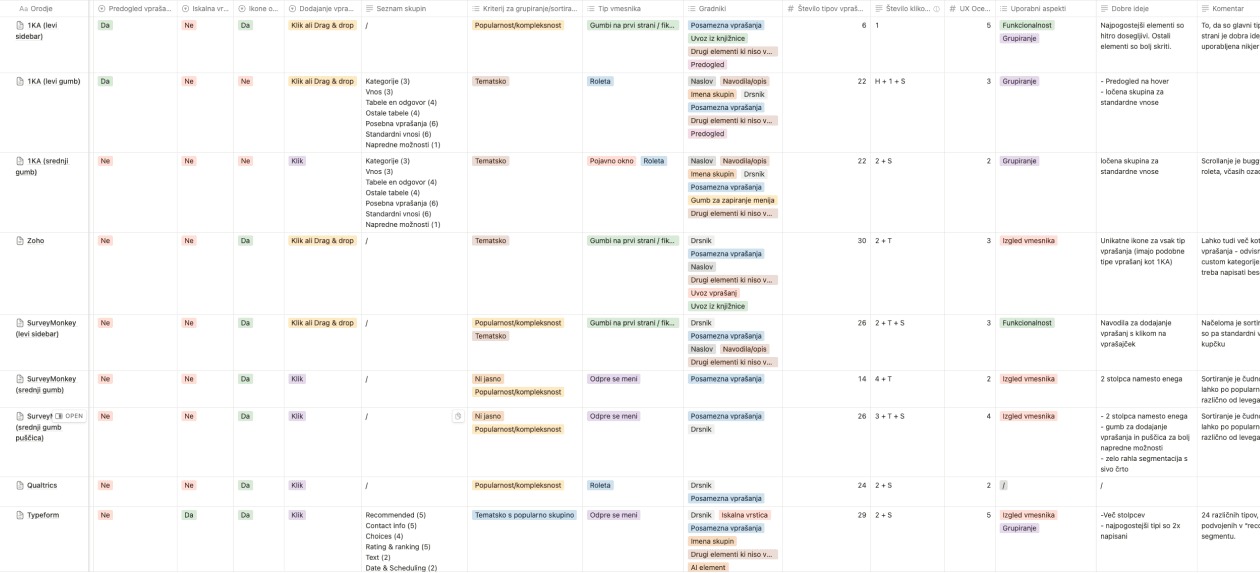
Table of variable values for all reviewed survey tool
Card sorting
For the card sorting, I recruited five participants and ran a semi-open session with 37 cards. Each card showed a question type's name, description, alternative names, and a 1KA screenshot. Participants sorted the cards into their own groups and named them. I then standardised group names across participants, built a similarity matrix, and analysed both aggregate patterns and individual reasoning.
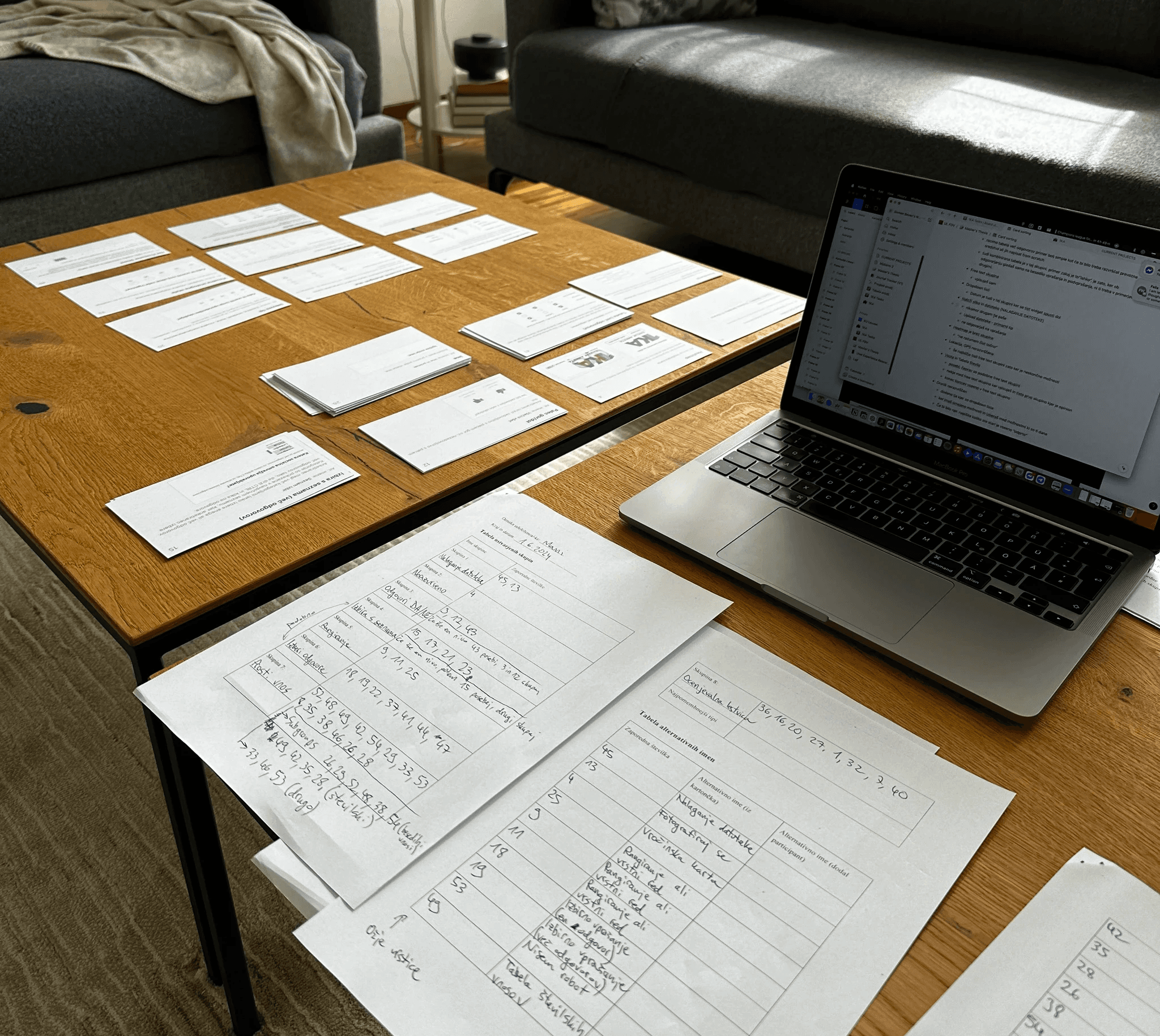
Photo from the pilot card sorting session
Key findings
22 out of 23 tools in the competitor analysis included icons next to question types. 1KA was the only one that didn't. The more usable interfaces used two or three columns, avoided tabs or collapsible groups, and kept groups thematically coherent, typically four to eight items each.
The card sorting produced a more surprising result. Users don't categorise question types the way survey methodologists do. Methodology separates types primarily by number of dimensions and measurement scale. Users largely ignore both. They group by practical purpose first, visual similarity second, and only then by input type or number of allowed responses.
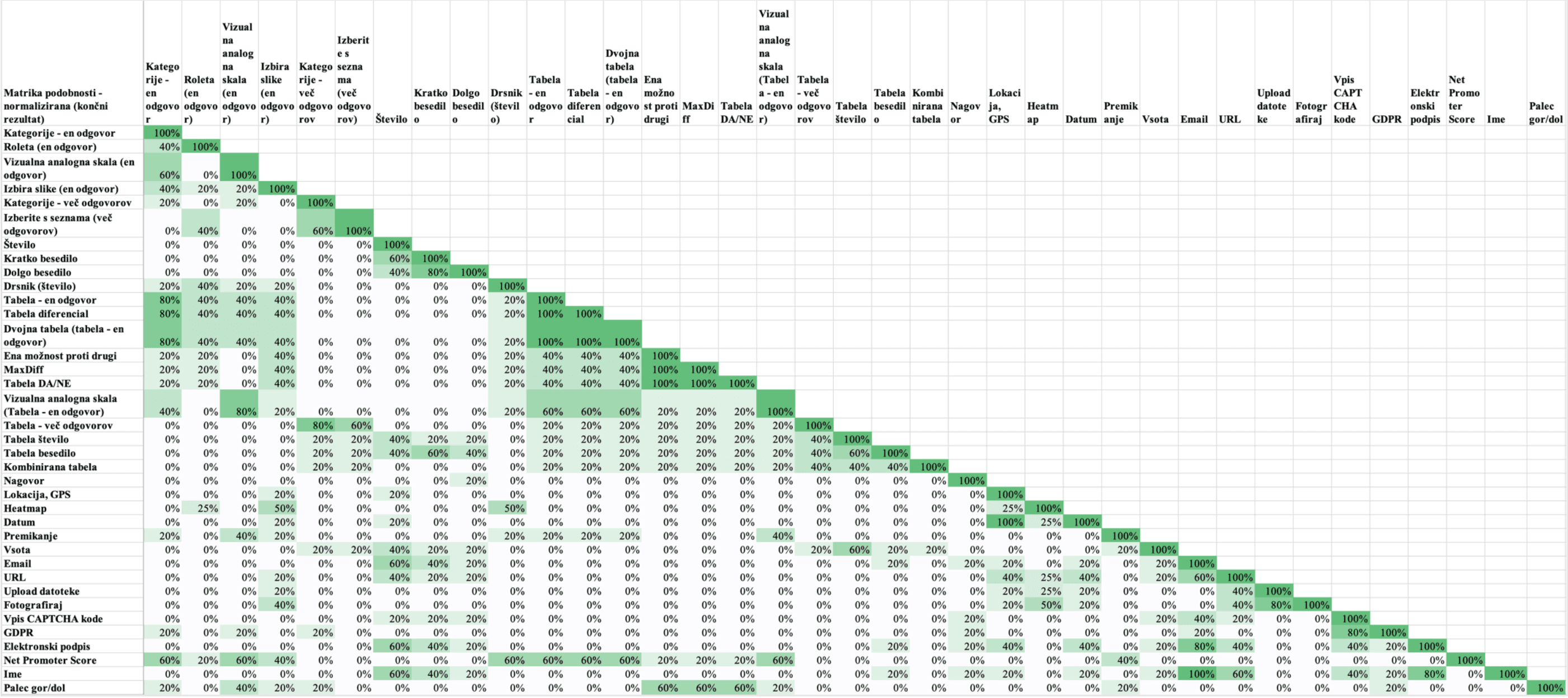
Similarity matrix made from the results of the card sorting study
Participants also drew a clear line between single-answer and multiple-answer question types, a split most competitor tools collapse into one group. And they treated tabular question types not as their own category, but as multi-item versions of their single-item equivalents.
The solution
I developed a redesign proposal with ten thematic groups and 38 question types, plus nine UI components for the interface.
The ten groups (Single answer, Multiple answers, Introduction, Text and number input, Rating scales, Binary choice, Predefined inputs, File upload, Formalities, and Other) came directly from the card sorting data, adjusted against 1KA's internal usage statistics. The most common question types appear at the top of their groups. I avoided a separate "favourites" category, which would have created redundancy with the existing secondary sidebar.
The UI changes addressed the interaction-level problems: icons for every type, hover-state previews with descriptions, a three-column layout to reduce scrolling, a close button, a section header, and a visually separate section for non-question elements like Calculation and Quota. Several question types also got new names based on the alternatives participants most consistently preferred. "Kategorije – en odgovor" became "Izbirno vprašanje (en odgovor)", "Število" became "Številski vnos", "Roleta" became "Spustni seznam".
I then built a high-fidelity Figma prototype through several iterations and delivered it to the 1KA team alongside the written proposal.
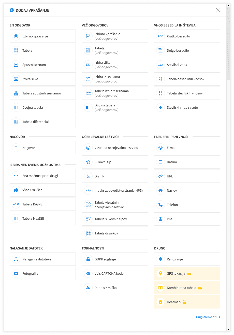
The final design of the "Add question" modal
Outcome
The thesis produced a research-backed redesign covering interface structure, information architecture, component design, and naming, grounded in competitor analysis across 22 tools and card sorting with five users.
The main limitation, however, was sample size. Five participants is appropriate for exploratory card sorting but limits statistical confidence. A follow-up study with a larger sample, split between novice and expert users, would have given the group structure stronger footing. I'd also have wanted to run a tree test on the proposed structure to validate findability before handoff, rather than inferring it from sorting patterns.
Working directly with the platform's lead kept the research grounded in real constraints from the start, including internal usage statistics, backend architecture, and the need for backwards compatibility.