RALExILA
A blueprint platform for adult learning across Europe
April 2025 - July 2025
Key outcomes
• Fully clickable Figma prototype of the learner experience • Presented to policymakers from across Europe in Brussels • Sparked direct collaboration interest from Slovakia's Ministry of Education • UX review shaped the final published system model
The problem
EU countries handle adult learning very differently. Some have centralised digital registries, others have nothing. Funding ranges from vouchers to direct subsidies to employer co-financing. The RALExILA project (EU-funded, 10 countries) set out to create a shared system model: a blueprint any country could adapt for their own adult learning platform.
The model defined what the platform should do: course discovery, provider management, Individual Learning Accounts for funding, skills tracking. But it was a dense technical specification. My job was to turn it into a tangible, interactive prototype that stakeholders could react to, and to validate whether the specs held up when translated into real UI.
My approach
Interrogating the specs before designing
I did a deep review of the system model, leaving dozens of inline comments questioning ambiguities and pushing back on scope. For example:
• The funding model described three entitlement types (money, vouchers, learning hours) but didn't address what happens when a user has a mix. I flagged this and proposed simplifying the UX by drawing a parallel to how Audible handles credits vs. cash: two clear payment paths, not an open-ended system.
• "Digital Credential Issuance" was listed as a feature, but building it would mean embedding an entirely separate product. I flagged it as out of scope and proposed working with external credentialing systems instead.
This review shaped the design direction before I drew a single screen. It also served as direct feedback for the spec author, and several of my observations made it into the final published system model.
Designing for flexibility across countries
This wasn't a product for one client, but rather a blueprint for countries with completely different policies. The funding module had to work whether a country uses vouchers (like Croatia), credits (like France), or something else entirely. I designed the entitlement and payment flows to be modular: same structure, swappable funding types.
Focusing on the learner journey
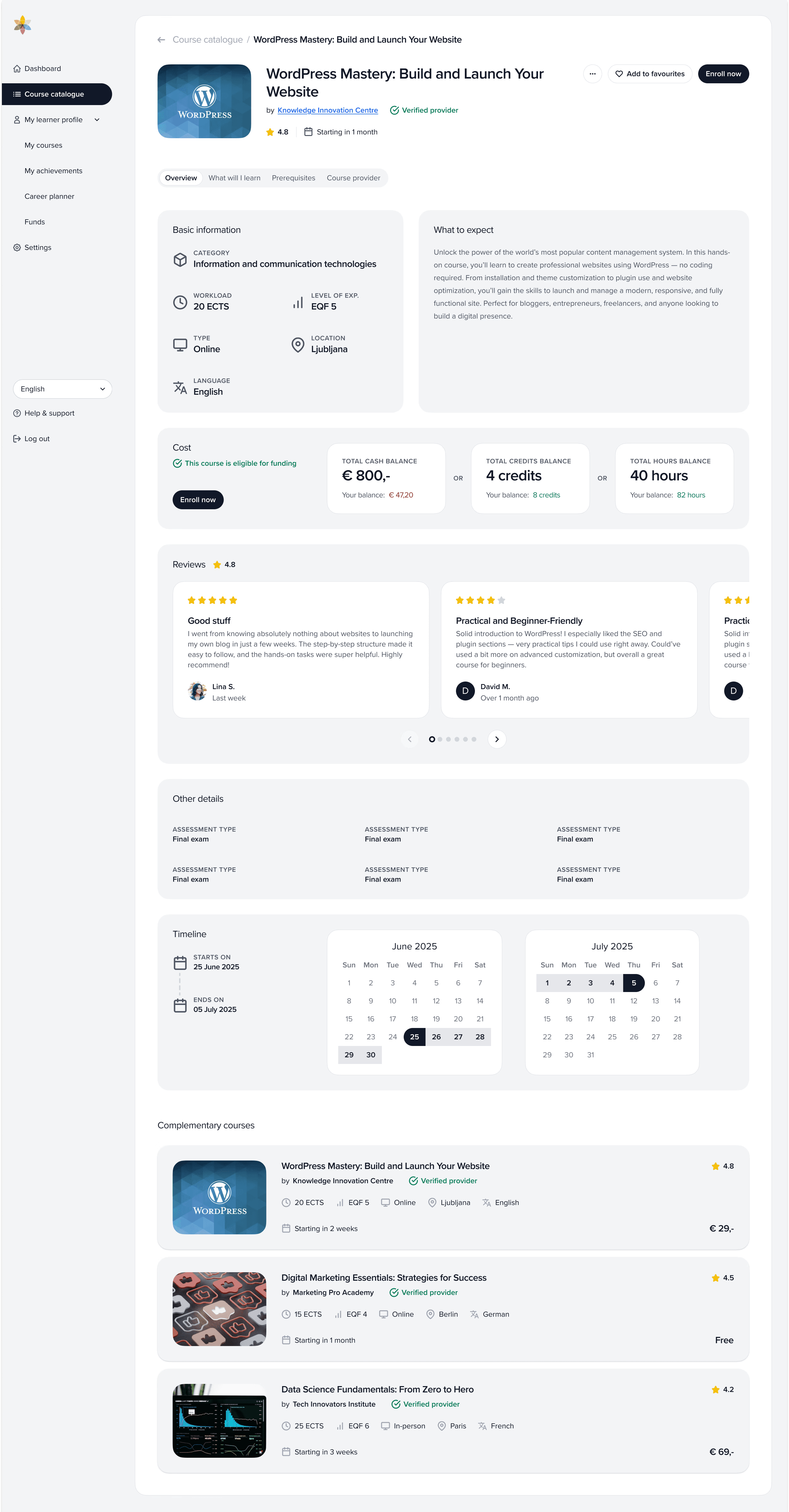
This covered course discovery and filtering, course comparison, enrolment, funding/entitlement usage, credential storage, and profile management.
The Solution
The Figma prototype is a fully interactive walkthrough of the learner experience. Some of the key decisions were:
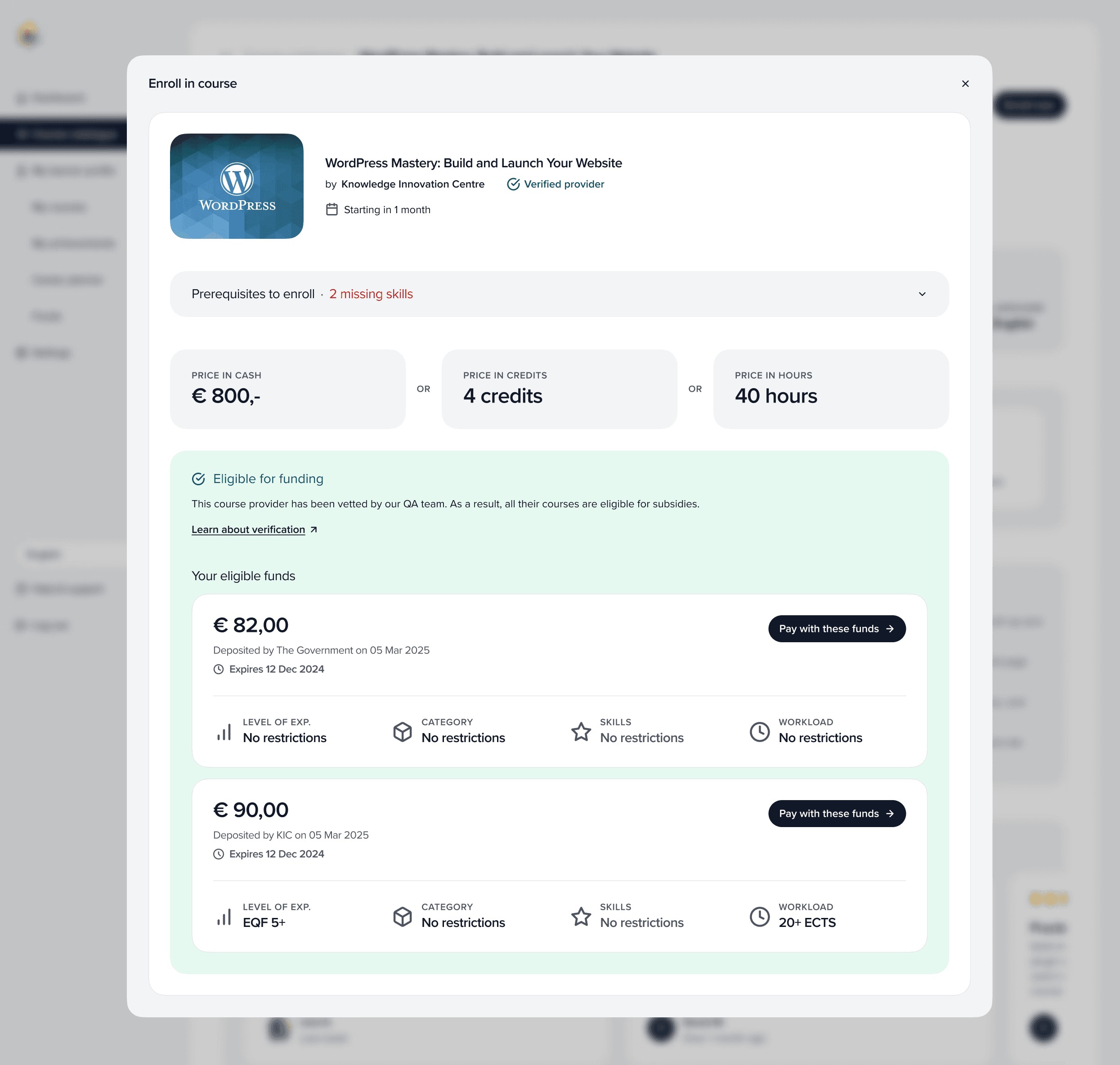
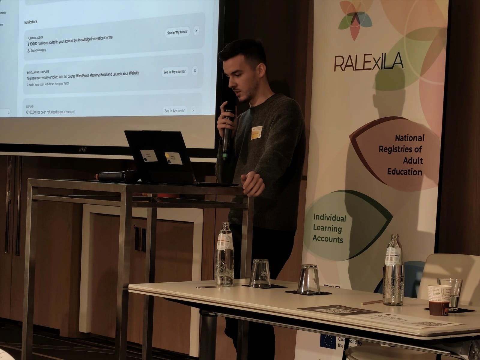
A funding system users can understand
The ILA section shows available balance, funding sources, and transaction history. When enrolling, the user sees clearly which funding applies and what's out-of-pocket. Kept simple and linear despite the underlying complexity.
Course discovery that handles extreme variety
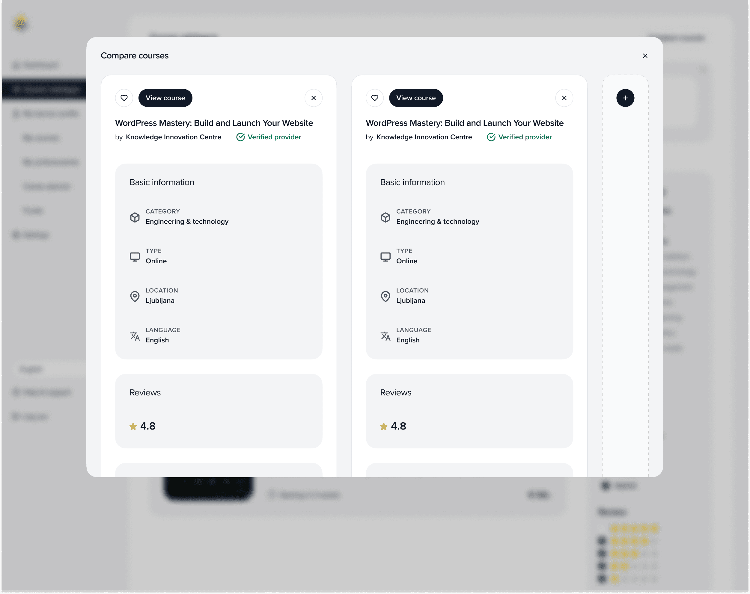
Courses in this system range from formal university programmes to informal community workshops, all in the same interface. The filtering system had to accommodate topic, provider, format (online/in-person/blended), EQF level, funding eligibility, and location, while still feeling straightforward for users who may have low digital literacy.
Clean, brandable UI
Since this could theoretically be whitelabelled by different countries, the design stays neutral and component-based, easy to reskin without rebuilding.
The Outcome
I presented the full prototype at the RALExILA conference in Brussels, a 15-minute live walkthrough for policymakers, ministry representatives, and adult education experts.
After the presentation, a representative from Slovakia's Ministry of Education approached me saying they were actively building something similar and wanted to collaborate. That validated that the prototype successfully bridged the gap between abstract policy specs and concrete product thinking.
Screenshots